Article continues below
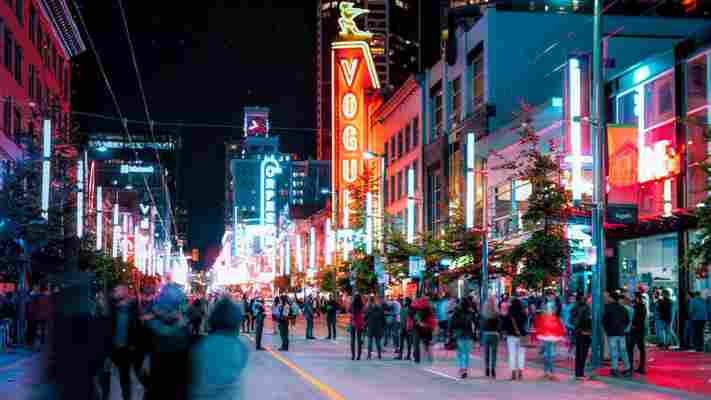
Wide shot: a city’s majestic backdrop of sea and sky, skirted by folds of Douglas fir, and deep, zigzagging fjords. Zoom in: a downtown core on the rise, a mixture of newly built condominiums, theatres and red-brick saloons. Close-up: in the middle, a hodgepodge of advertising signs and overhead utility lines rearing out of the darkness. And the big picture: the sky electrified in a glow of red, yellow and green as 19,000 neon lights switch on.
Step back in time to 1950s Vancouver, and this is what would have greeted you after sailing across the Georgia Strait to the city’s historical district of Gastown . From here to the suburbs, the streets hummed with transporters and Frankenstein-like glass insulators. Logging agencies, lumberjack recruiters – even churches – advertised with neon lettering, while residents amped up their houses with neon door numbers. Harder to believe still, the city produced more strip neon than anywhere else on the planet, with one sign for every 18 residents, and 12 factories, including the world’s largest.

Vancouver, Canada, was one of the first capitals of neon, with one sign for every 18 residents (Credit: Michael robertharding/Alamy)
You may also be interested in: • The strange US-Canada border dispute • Where wireless communication was born • Bhutan’s dark sense of humour
Stories like this aren’t supposed to happen in the middle of the Pacific Northwest’s beautiful temperate rainforests. Maybe in Hong Kong, Las Vegas or Shanghai, cities where streets besieged with neon are part of downtown lore. But Vancouver, Canada’s great-outdoors capital? The sheer volume of neon colour juxtaposed with its beautiful natural setting seems alien. Yet the truth that it was one of the world’s first capitals of neon is unlike anything stereotypes of the city might lead you to expect.
To learn more, I contacted John Atkin, a Vancouver-born civic historian, heritage consultant and neon expert. “Neon and rain are made for each other – it makes the colour diffuse and come alive – and that really helps explain why there was such a boom here,” he said as we toured the Museum of Vancouver ’s permanent neon gallery on an overcast afternoon. “Vancouver has more grey days than anywhere else in North America, but it was also a streetcar city, which advertising neon is perfect for. Add the weather to the transport system, then factor in the low cost of leasing the signs as manufacturers began competing with each other, and neon boomed. It worked here.”
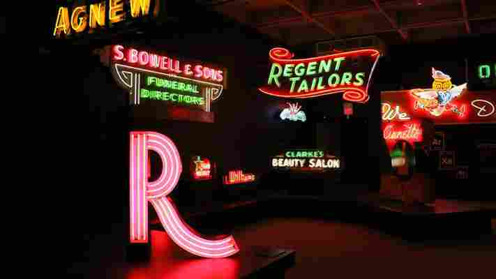
The museum’s rich collection of aged and weathered signage comes from the groundwork of Atkin, who first curated an exhibition on the city’s neon history back in 2000. Two stand-outs are a gigantic pink-striped ‘R’ from Regent Tailors, first hung on West Hastings Street in 1960; and a buzzing red and green headstone designed for S Bowell & Sons Ltd Funeral Directors from the previous decade.

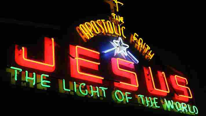
Even Vancouver’s churches advertised with neon signs (Credit: Mike MacEacheran)
According to Atkin, the key thing that set Vancouver apart was the majority of sign makers here were art-school graduates. That meant there was a real consideration for design, and streets became canvases of typography, colour and action. The definition between where the building finished and art began started to blur.
“The artists had fun with it,” said Atkin, as we looked upon one-sided mounts advertising a beauty salon, a dry cleaner, a garage, a dairy and a pool hall. “In the 1940s and 1950s, Vancouver wasn’t just lit by neon – it was illuminated with stories.”
Vancouver wasn’t just lit by neon – it was illuminated with stories
Atkin clearly remembers the tales that illuminated his childhood. When he was a boy, he used to cycle through the inner city on his way to swimming practice. He was an early riser, and somehow felt drawn to the rainbow-coloured signs on downtown Granville Street in the pre-dawn light, particularly vibrant around 05:00.
Share such stories with Vancouverites today and many will be puzzled. Tell them trees were covertly planted beneath well-known signs to blot out the visual noise and they’ll scarcely believe you. But there’s a good reason: the signs have all but gone, with most consigned to the scrapheap.
For history hasn’t been kind to Vancouver’s neon. Did it signal glamour and big-city living – or was it a vulgar display that vandalised a city? From the 1950s to 1970s, this was the question that divided the city, with neon becoming a symbol of a deep civic controversy and a lightning rod for critics.

The Museum of Vancouver houses a permanent exhibit showcasing some of the city’s historical neon signs (Credit: Mike MacEacheran)
(Credit: Mike MacEacheran)
The Museum of Vancouver houses a permanent exhibit showcasing some of the city’s historical neon signs (Credit: Mike MacEacheran)
(Credit: Mike MacEacheran)
The Museum of Vancouver houses a permanent exhibit showcasing some of the city’s historical neon signs (Credit: Mike MacEacheran)
(Credit: Mike MacEacheran)
The Museum of Vancouver houses a permanent exhibit showcasing some of the city’s historical neon signs (Credit: Mike MacEacheran)
(Credit: Mike MacEacheran)
By the 1960s, a growing suburbia meant neon had become demonised and associated with urban blight. “You can have civilisation, or you can have neon,” said one detractor, the criticism ironically lit up as a display at the museum. “It is vital to Vancouver’s reputation as a beautiful city… that these proposed sign controls be implemented before any more visual squalor is added to our most attractive streets,” said another at the height of the backlash.
To the city’s lawmakers, the signage frustrated people’s expectations of what Vancouver – surrounded by a northern cape of mountains and forests – should be. The throbbing glow was seen as an ugly, seedy distraction. So by 1974, the city adopted its first comprehensive sign control bylaw, restricting new neon signage beyond measure.
As Atkin sees it, the distaste came from a misguided realisation of just how corrosive to society neon was. “The bylaws made it damn difficult to do anything,” he said. “Everything that made neon cool – you couldn’t do it anymore. And with it the craft started to disappear.”
By the 1960s, Vancouver’s neon became a symbol of deep civic controversy (Credit: Archive Photos/Getty Images)
Today, examples of vintage neon still dot Vancouver, although you need to know where to look. For maximum impact, a walk through the city should take in The Orpheum and Vogue Theatre , two typographic verticals on Granville Street trimmed with bulbs. On nearby Hastings Street, a quick succession of marvels then spreads farther east, including signs such as those at Save On Meats , The Balmoral and The Pennsylvania (hotels turned social housing projects) and Ovaltine Cafe , a city fixture dating to the early 1940s.
We’re bringing the neon back
However, thanks to newly tempered bylaws keen to curtail downtown’s commercial decline, change is gathering pace, particularly in Chinatown, an area intrinsically tied to neon’s rise and fall because of the propensity of restaurants to embrace the advertising. Walk along East Pender Street and you’ll come to Sai Woo , a nearly 100-year-old restaurant, restored and reopened in 2015 as part of the area’s ongoing gentrification. Here, the unmissable 3x2m neon cockerel advertising chop suey – paid for by a community-supported C$19,000 Kickstarter campaign – is just the start of a welcome revival.
“We’re bringing the neon back,” owner Salli Pateman told me, while staring out at the two-sided gold-and-green cockerel sign. “It’s happening again, and a year from now there’ll be five or so more places with signs like this. We’re salvaging the heritage of this neighbourhood.”
The message is clear: there’s a new generation willing to embrace the visual noise.
Owner Salli Pateman raised nearly C$20,000 to locate and restore the Sai Woo restaurant’s original neon sign (Credit: Mike MacEacheran)
Next for Chinatown is the return of Foo’s Ho Ho, Vancouver’s oldest Chinese restaurant and a place famous for a once-notorious neon artwork. It was the address for an incredibly complex four-storey sign depicting a two-sided bowl of steaming noodles with flashing, alternating English and Cantonese words. The campaign to restore it has been masterminded by restaurant owner Carol Lee. Designed from scratch by Atkin using a more streamlined design, and paid for through heritage grants and donations, the C$80,000 signboard will be unveiled later next year.
It creates a sense of nostalgia, but also community
But while such visual ambition forms part of a wider lighting strategy to revitalise downtown Vancouver, it’s about more than just adding drama to the cityscape for locals. “It creates a sense of nostalgia, but also community,” said Pateman, looking up and down the street with a look of marked confidence. “When these signs are switched on, people will know Chinatown is back.”
The ultimate symbol of Vancouver’s transition from west coast logging town to vibrant metropolis, neon was once the city’s hallmark. Tomorrow’s Vancouver – shining bright – will be as much a reaction to its past as it is a celebration of the future.
Join more than three million BBC Travel fans by liking us on Facebook , or follow us on Twitter and Instagram .
If you liked this story, sign up for the weekly bbc.com features newsletter called "If You Only Read 6 Things This Week". A handpicked selection of stories from BBC Travel, Capital, Culture, Earth and Future, delivered to your inbox every Friday.
Leave a Comment